In my role at Bluefrog, I collaborated with the stakeholders at Cruse to improve the usability and experience of their website. Cruse is a fantastic organisation, offering vitally important help to those in need so this was a great opportunity to use my skills for a good cause.
Discovery phase
Like most projects, I started by getting to know the organisation, understanding the services they offer, who their audience are and what they hope to achieve.
Old website homepage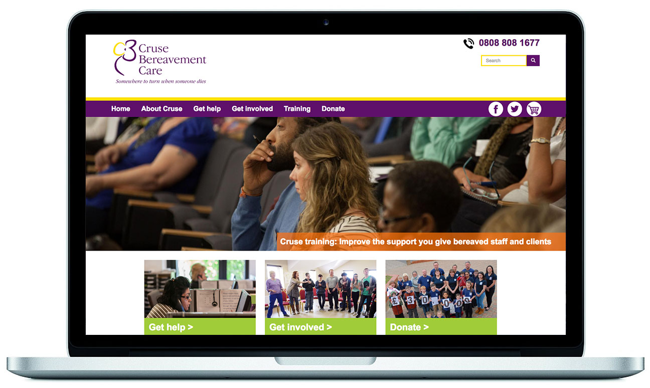
It was clear that the website required some attention. The content was good and their was a lot of it, but the design didn't meet modern expectations visually or in terms of usability - it was difficult to navigate and didn't clearly promote the organisation's services.
The following project objectives were agreed upon:
Improve the user's journey and experience, so that users:
- Get the information, help and support they need as quickly as possible
- Get the best possible experience, service and impression of the organisation
- Can clearly see how they can help and support others and the organisation
User research
I performed a remote usability test with 10 participants to see how easily they could accomplish a series of tasks related to our objectives. The tests validated my assumptions so I focussed on the following areas:
- Improve the navigation and 'signposting' throughout the website
- Improve the readability, accessibility and appeal of the content
- Eliminate friction points for users trying to interact with the organisation
Tidying up
Logo
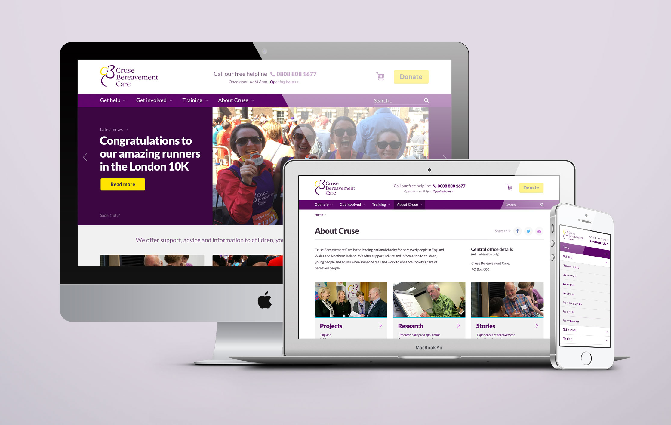
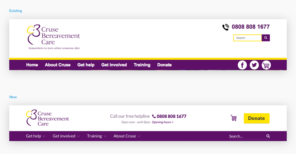
My usability testing had highlighted that the existing Cruse logo conveyed the organisation's purpose very effectively at a glance. By removing the logo's strap line, I was able to reduce the height of the header, creating a cleaner look and feel, and avoiding readability issues when the logo is scaled down on smaller devices.
Helpline
Users would have to perform a number of clicks to reach detail about the helpline opening hours, the call cost etc. To improve this, I added information alongside the number, incorporated an "Open" or "Closed" message for clarity, and moved the feature to a more prominent central position in the header.
Search
To simplify the experience of finding content, I grouped the search function alongside navigational items. This also allowed more prominence to be afforded to the "Donate" button - now situated in it's place.
Navigation
I simplified the design of the navigation by removing the decorative yellow border and incorporating arrows to give affordance to those sections with a deeper structure. I also reviewed and made a few adjustments to the site's Information Architecture. This followed a brief card sort where a more logical structure emerged.
By convention, most users are familiar with clicking or tapping on the logo to return to the homepage so a "Home" link is arguably redundant. Removal of this allowed more space in the navigation for highlighting "active states" (the section being viewed) and also helps focus the user's attention on our most common journeys.
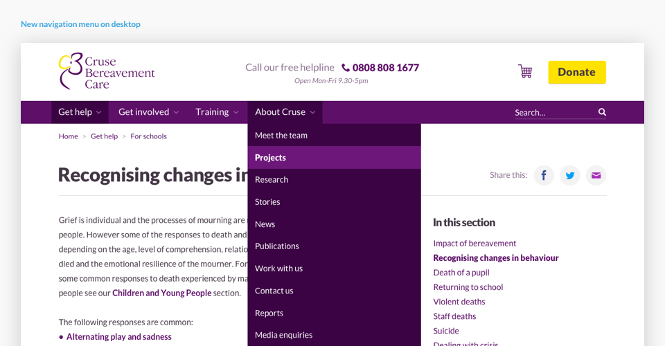
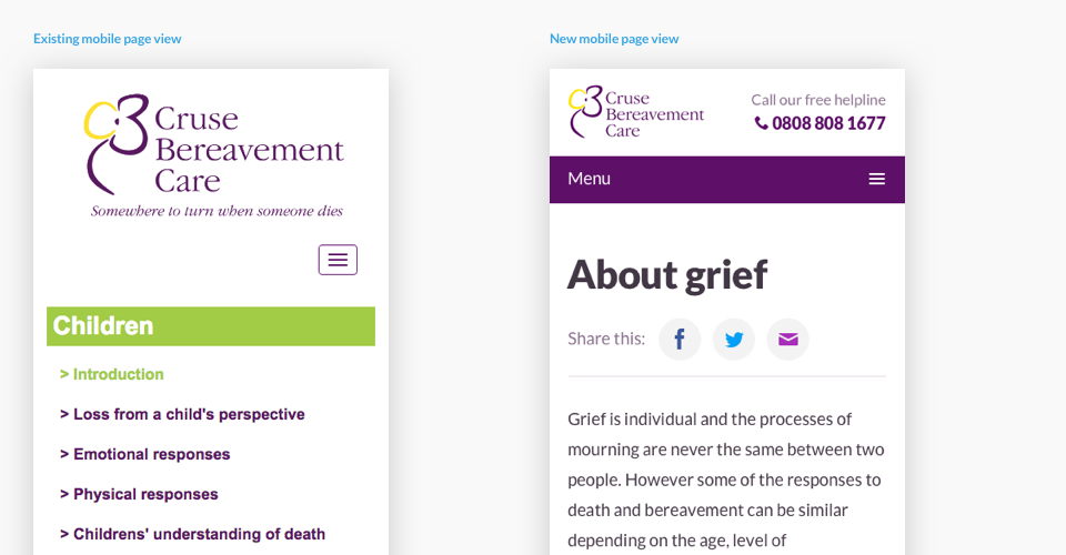
I also simplified the sub-navigation (see "In this section" above), combined with a new "breadcrumb trail" to aid users in navigating the site and understanding their current location.
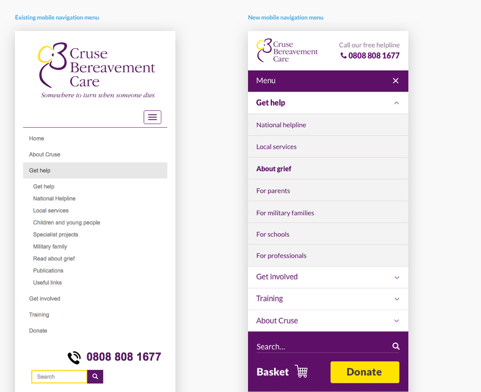
Mobile experience
Nearly half of all traffic to the website was on a mobile device yet the mobile experience was very poor. Given the nature of the organisation's work and the context of use for many of their users (unlikely to be sat at a desktop computer), It was crucial that we offer these devices a compelling, usable and engaging experience.
To improve this, I reduced the height of the main header, made the navigation more prominent (our testing illustrated that users often missed the menu button) and most importantly featured the helpline in a more visible location.
Usability
My initial review of the website highlighted a number of usability issues to be addressed:
- Clearer headings for each element to aid users in scanning the page (most users do not read all text, they will scan through looking for something of interest).
- Ensuring elements are afforded the visual prominence necessary to distinguish from other, less important elements. This creates a clearer page hierarchy and aids the user in discovering the content they need.
- Clearer slideshow navigation, showing the number of slides and more prominent interactive areas.
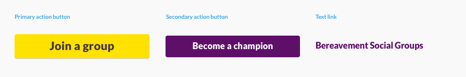
- A more consistent use of interactive colours. For example: purple for text links; yellow for "action" buttons; and purple for secondary "action" buttons (see below).
Clearer journeys
I wanted to make sure the homepage catered for the most common use cases of the website, such as:
- A user in need of help and support online
- A user in need of help and support locally
- A user who wants to support Cruse
- A user who needs information and advice
- A user in need of training or professional advice
I re-worked the homepage to help direct users into these journeys quickly and easily. Comparison of old and new design below:
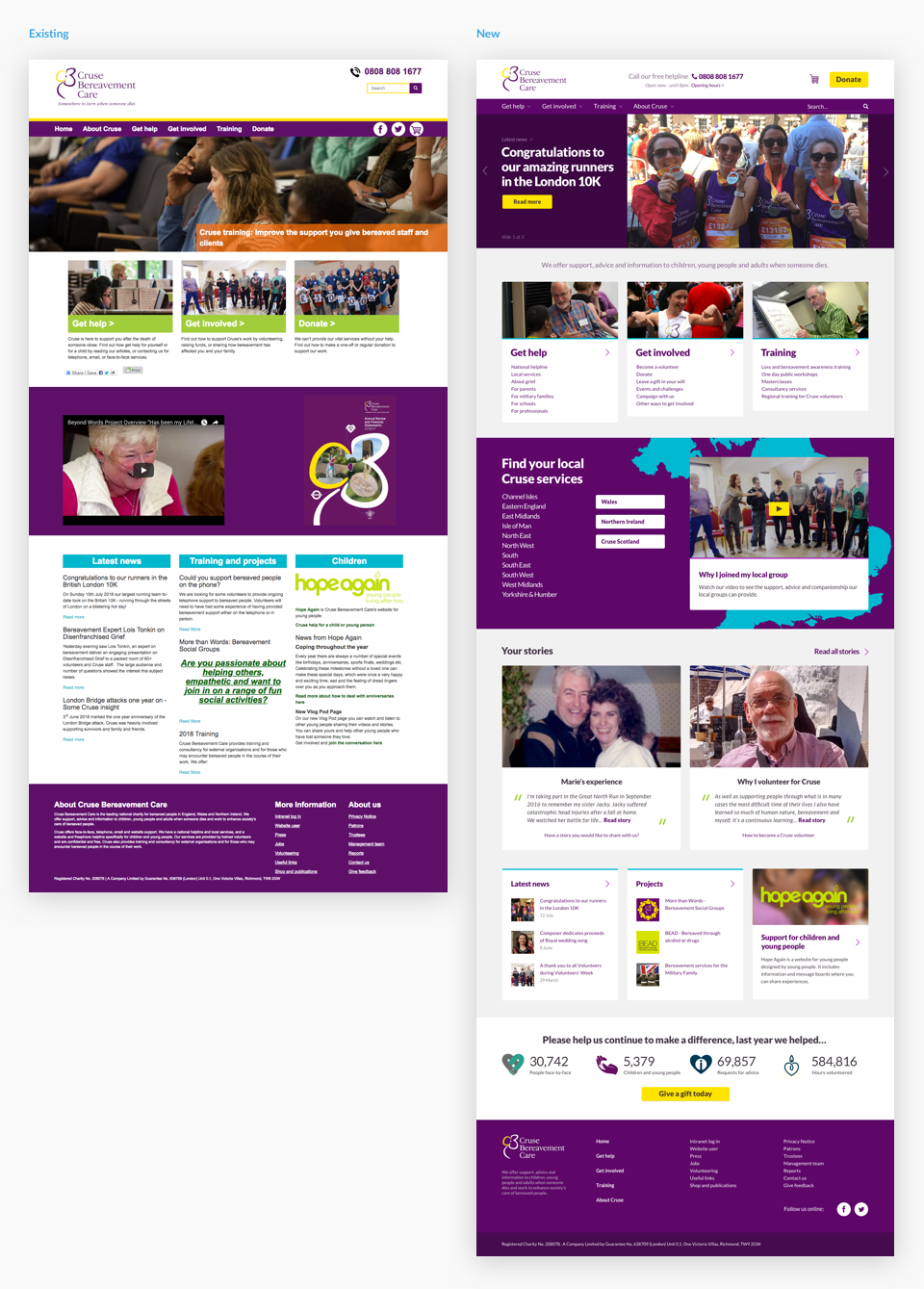
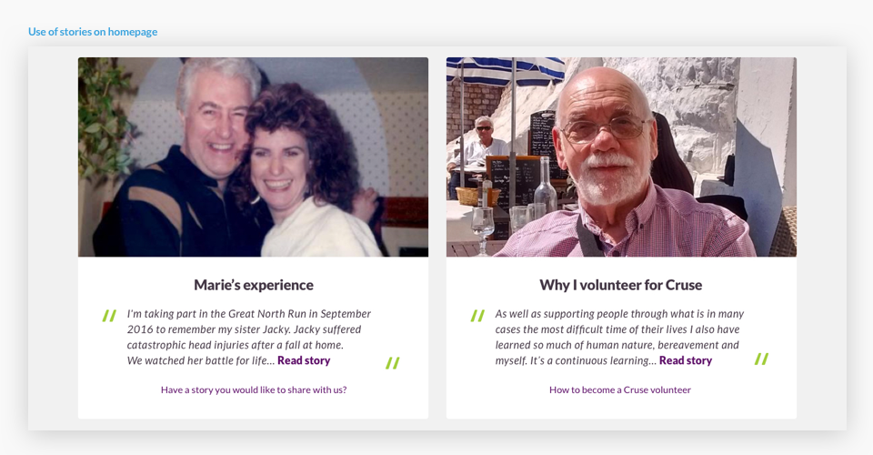
Letting the work tell the story
Whilst tidying up the homepage design I also tried to make more of the existing website content, pulling out stories to help engage and re-assure users about the services provided, and incorporating images alongside news and project content.
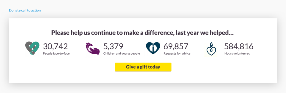
Donate becomes the final call to action
My user testing indicated that some participants were not clear on how Cruse was funded, why they needed donations and how many people they actually help. To resolve this, I included a brief call to action at the base of the homepage outlining key achievements and details of how the user can help to continue this work with a donation.
CSS tidy up
I incorporated a more structured and consistent use of typography, opting for the free-to-use "Lato" web font for it's clarity, readability and modern aesthetic.
To improve page structure and content hierarchy, I applied a more consistent heading sizing system. I also utilised a more constrained use of the colour palette to give emphasis to interactive elements, for example strictly using dark-grey for text and purple for text links.
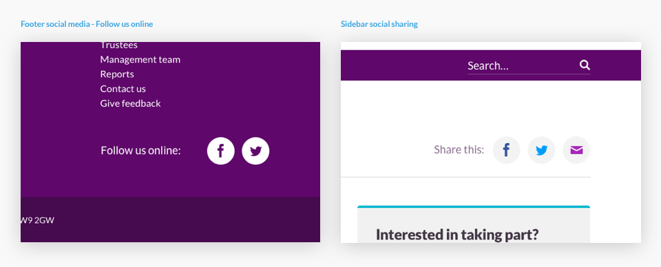
Social media
Social links tend to work best in the footer if they are linking to an organisation's profile so I moved these out of the header and into the footer, adding a heading to explain their function. I also added clearer social sharing buttons alongside page content.
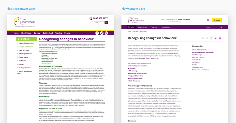
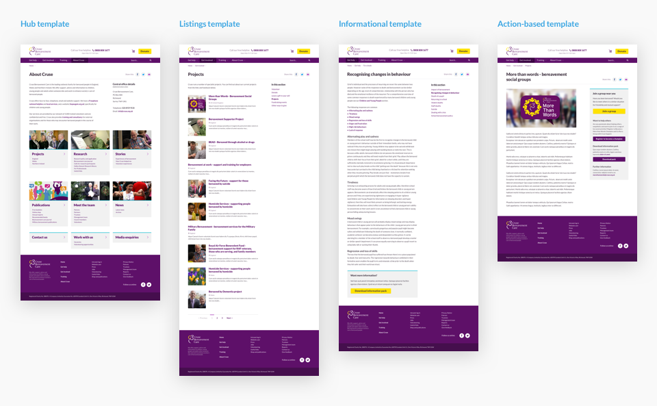
Template changes and new hub pages
To improve usability and ensure a more consistent experience throughout the site, I re-designed and simplified the existing site-wide templates.
Outcome
The feedback so far has been very positive, internal staff and service users alike have found the website far easier to use.
"This is such a great achievement. The new version is miles better when viewing on a mobile too. Congratulations to the team for doing such a great job."
"Brilliant! The changes have made a huge difference."
"Looking much improved, and very easily navigated."