I worked with carbon offsetting startup Gaach to create a visually engaging, intuitive interface for their website to encourage environmentally conscious visitors to plant trees in developing countries to offset their carbon footprint.
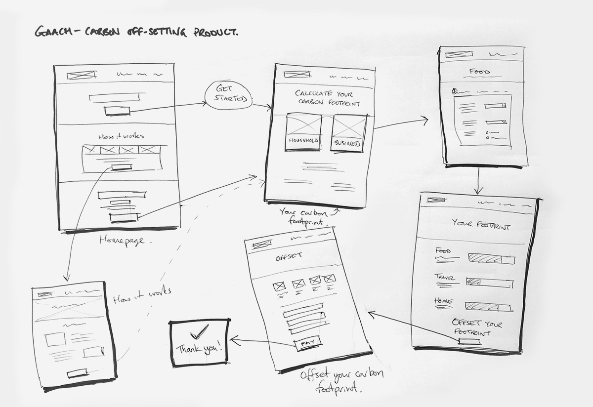
Sketching out the user flow around the product requirements
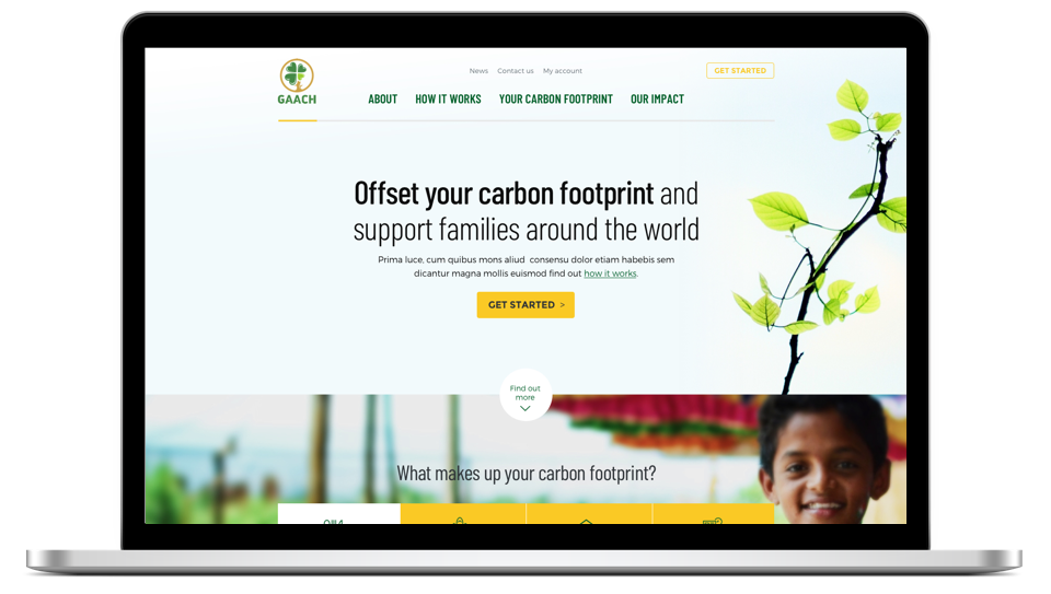
An interface that breathes
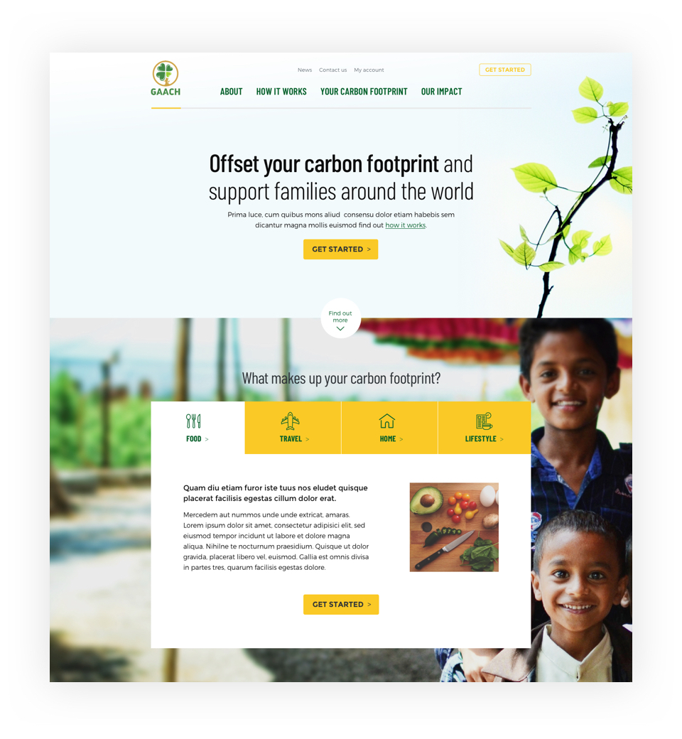
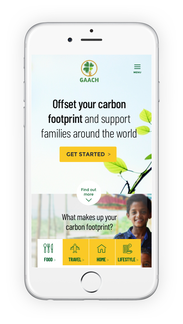
Given the environmental nature of the startup, I wanted the UI design to feel fresh, natural and leafy. I incorporated photography of plants, trees and nature alongside a complimentary colour palette of green with a highlight yellow to create a cohesive aesthetic, that could be applied throughout the interface to generate a clear visual hierarchy, highlighting key action points and interactivity.
Choosing the type of carbon footprint
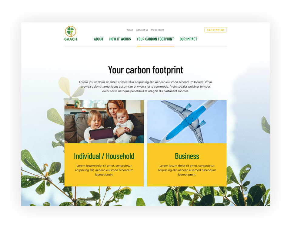
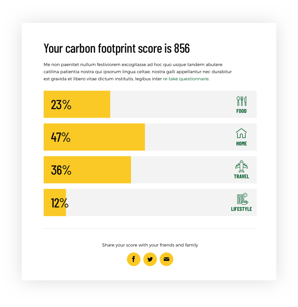
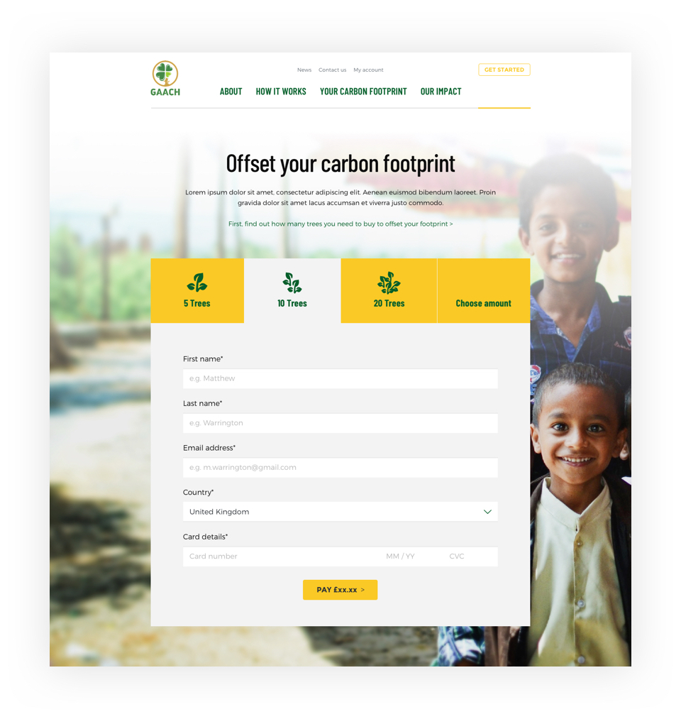
Users are guided into one of two journeys dependent on their carbon footprint type: individual/household or business. They are then asked a series of questions about their lifestyle to determine their carbon footprint. Once calculated the website suggests how many trees need planting to offset this footprint. Finally, users are given the opportunity to purchase the trees and send them for planting in a developing country.
Your carbon footprint score
I continued the natural aesthetic throughout the site, using imagery cropped to the sides of the page to create an immersive experience, the user is "wrapped" and "encased" in the foliage as if they were in a forest or jungle, reminding them of the importance of our environment.
Explaining how it works
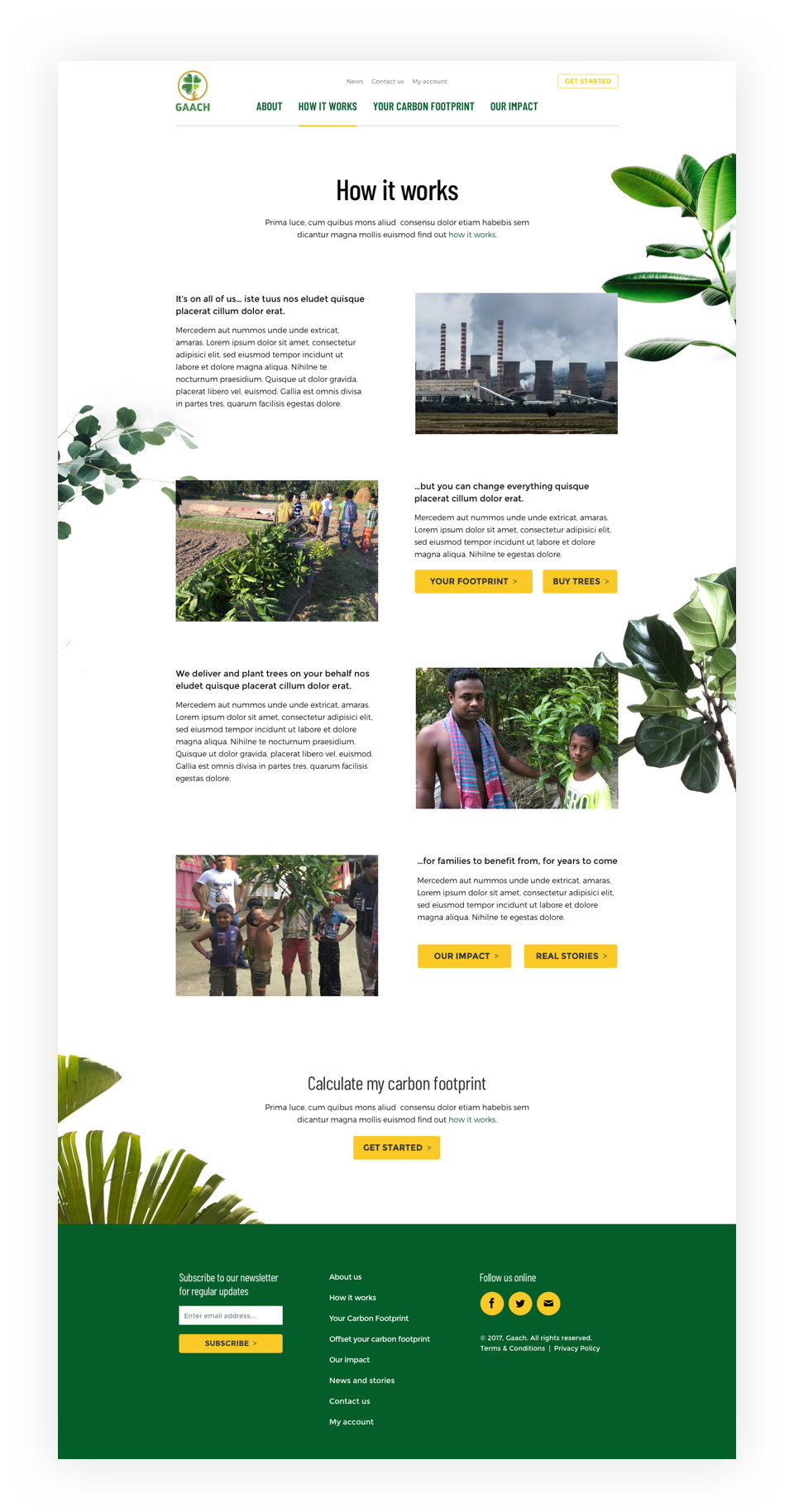
To reinforce the concept of giving throughout the site, I also incorporated imagery of the beneficiaries such as families in Bangladesh, the communities directly benefitting from the programme.
Creating an account
To keep the design clean and relatively minimal in approach I opted for the narrow "Barlow Condensed" typeface for headings partnered with the popular "Montserrat" typeface for enhanced legibility at smaller sizes.
Homepage
Responsive design viewed on mobile
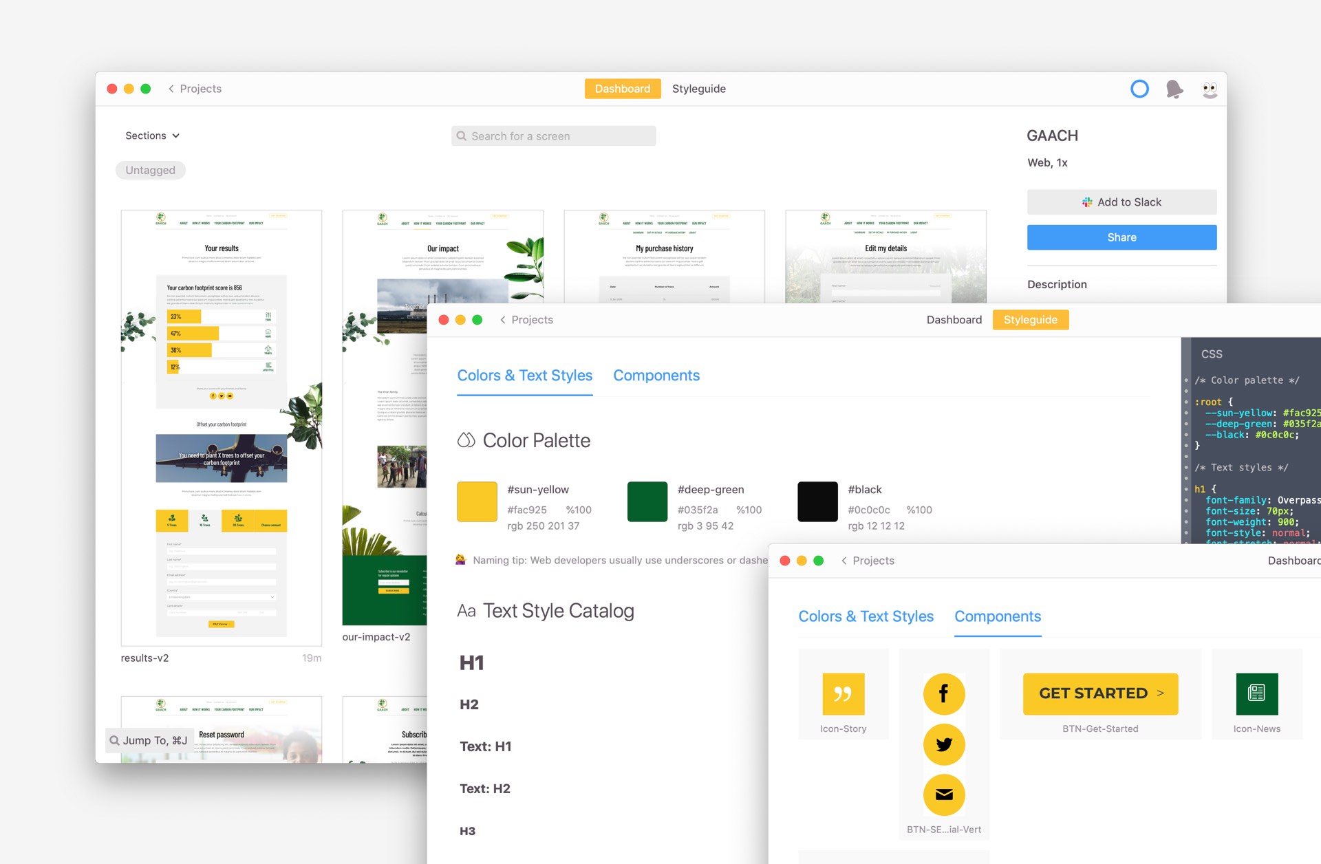
I created a simple style guide from my Sketch source file and also used Zeplin for developer handover so I could specify each component of the interface. This approach helped ensure consistency across the site, simplified development and ensures any future functionality discussions can adhere to the same principles specified here to reduce design and develop time.
Creating a set of design components in Sketch
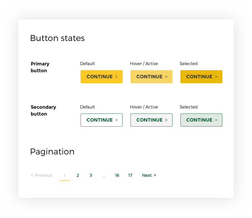
Exporting to Zeplin to document design specifications and to aid developer handoff