In my role at Bluefrog, I was tasked with the website redesign for Mothers' Union, a 140 year old organisation with over 4 million members worldwide. The problem was, they had an ageing website, lots of content and a non-mobile friendly interface so I proposed something a bit new.
Wearer of many hats
From the discovery phase through to the final user interface designs, I utilised user research, usability, information architecture, client presentation and UX / UI design skills alongside a project manager, internal stakeholders and the organisation's CEO.
Discussing users and prioritising their needs during an initial workshop
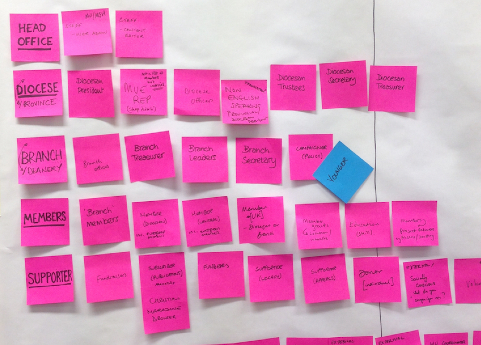
Discovery workshop with users and stakeholders
I co-hosted a workshop with 5 existing users and 9 stakeholders alongside our project manager to find out more about how they used the website, the issues they faced and to listen to their opinions on how the website could be improved.
Some initial learnings:
- Lots of content, hard to find
- Not mobile friendly
- Needs to appeal to a younger audience
- Champion the orgs work
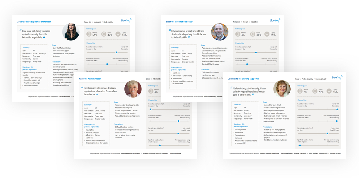
I defined key personas: Admins, Info seekers, Existing supporters, Future supporters
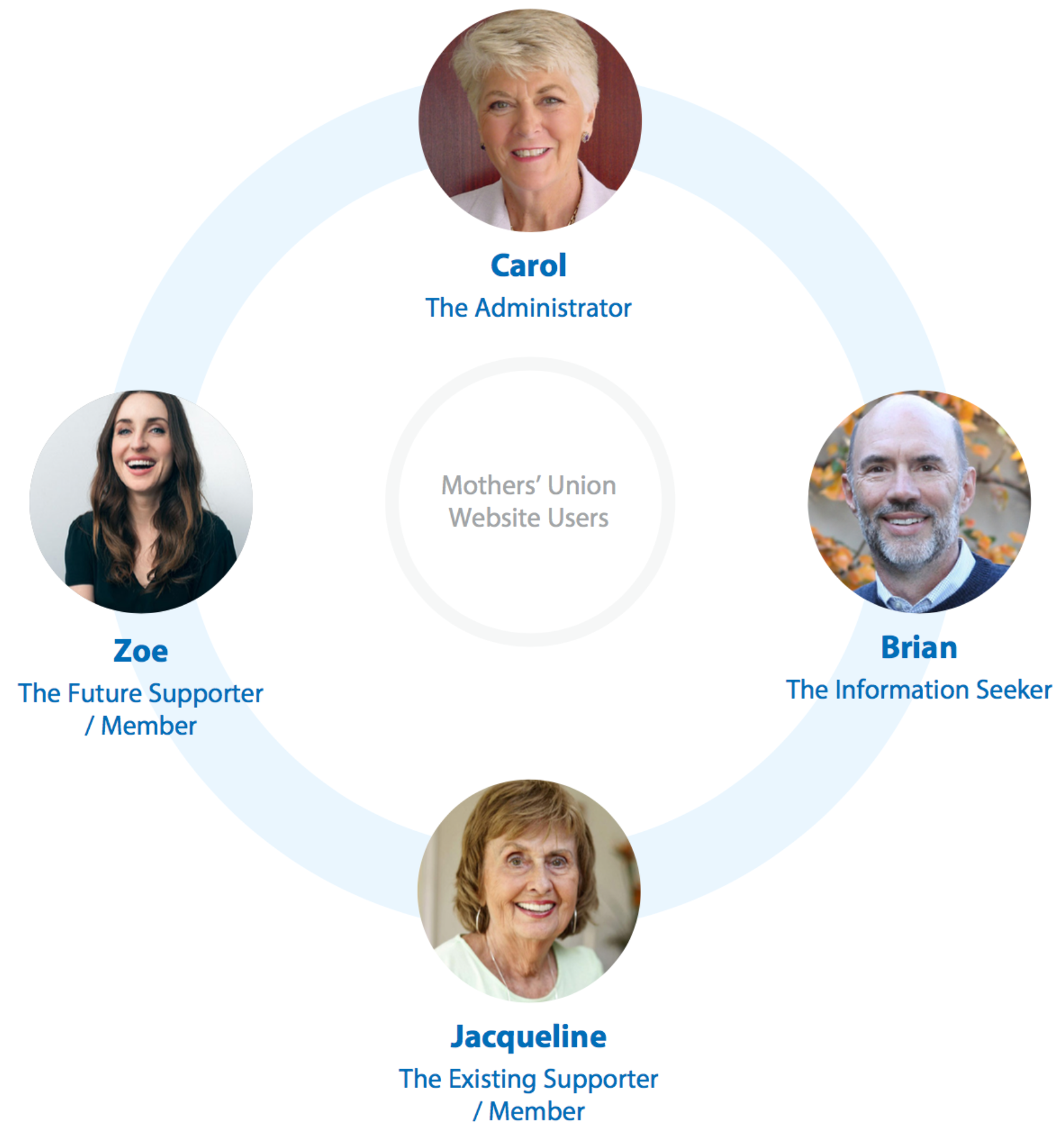
It was clear each persona was having difficulty locating content - section labelling was ambiguous and there was a reliance on organisational jargon.
User research - building personas following user workshops and interviews
Remote usability test with 5 particpants
Next I ran a remote usability test with 5 new users to complete a series of tasks to validate our findings and get their take on the navigation, aesthetics and overall impression of the website. The participants were 2x 55-65+ females, 2x 55-65+ males and 1x 35-40 of each gender.
Example tasks:
- What do you believe the organisation do?
- Where would you go to find prayer materials?
- Can you find out how to become a member and what your options are?
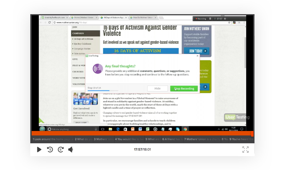
I used usertesting.com to perform the remote tests and this provided me with a video of each participant's experience attempting to complete the tasks.
Findings:
Organisation perceived as old fashioned, female only and non-inclusive
"I can never find the page I'm looking for"
"The font is too hard to read"
"Doesn't work on my iPad"
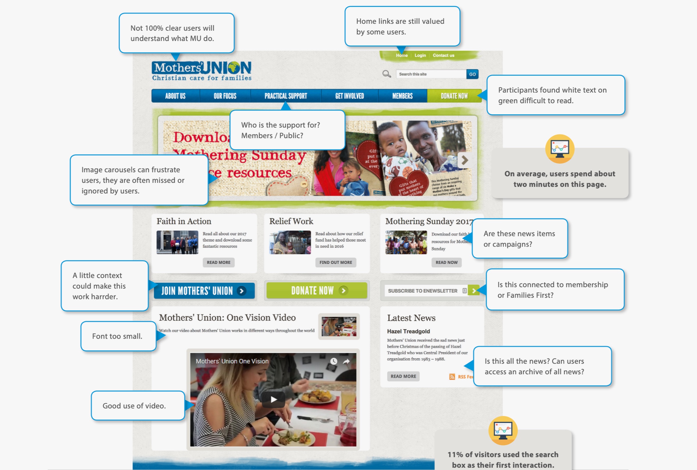
Reviewing the website
I also reviewed the existing website’s usability myself and performed a Google analytics review to validate my earlier assumptions and also check bounce rates, device breakdowns and general user behaviour.
Some of my findings from a review of the existing website
Solution definition
Armed with the findings from my research I could now identify four keys areas for improvement:
Site structure - make it easier to find content
Messaging - clarity about the org, scannable content, visual hierarchy
Aesthetics - increase impact, use more compelling imagery, better typography
Accessiblity - meet the user needs - conform to WCAG AA standards
Information architecture
I knew an improved interface design with a clearer visual hierarchy would improve user experience but I also ran a series of remote Tree tests and a card sorting exercise with 50 participants using Optimal Workshop's online suite to address the site's structural shortcomings.
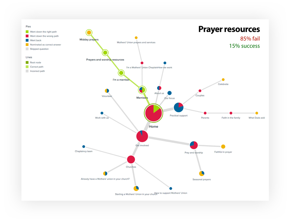
Test 1. Tree test
Using the existing structure to see how many users failed or succeeded locating a page.
Test 2. Card sort
Asked participants to group the website content and suggest group labelling.
Test 3. Tree test 2
Tested a proposed structure based on card sort results
Was it any better?
Prayer resource tasks went from 15% to 84% success rate
Donation tests rose from 54% to 84% success rate
More logical section labelling has made content easier to find
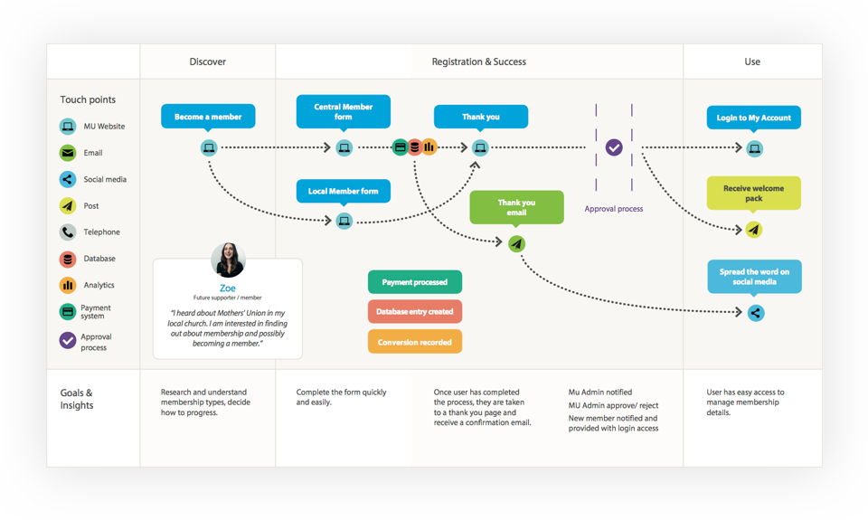
I mapped out key user journeys in-line with findings
Interface design
Armed with all the research and insights from the discovery phase, I settled on these design requirements:
- Clearer visual hierarchy, obvious actions
- Easier to read fonts
- A simpler, more flexible layout
- Responsive design
- Better use of imagery
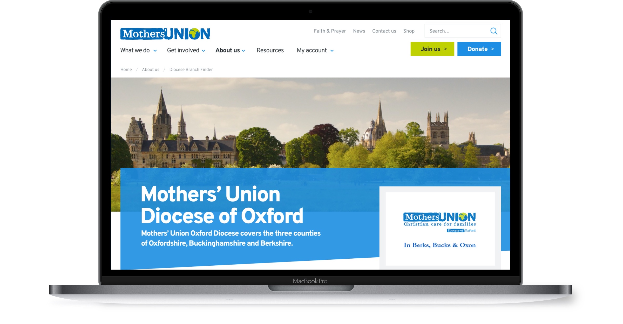
The final UI is both bold and vibrant whilst professional and authoritative in appearance. The angled colour accents give a dynamic feel which, combined with a generous amount of white space, and bold typography allow the site's content (photography, video) to really stand out.
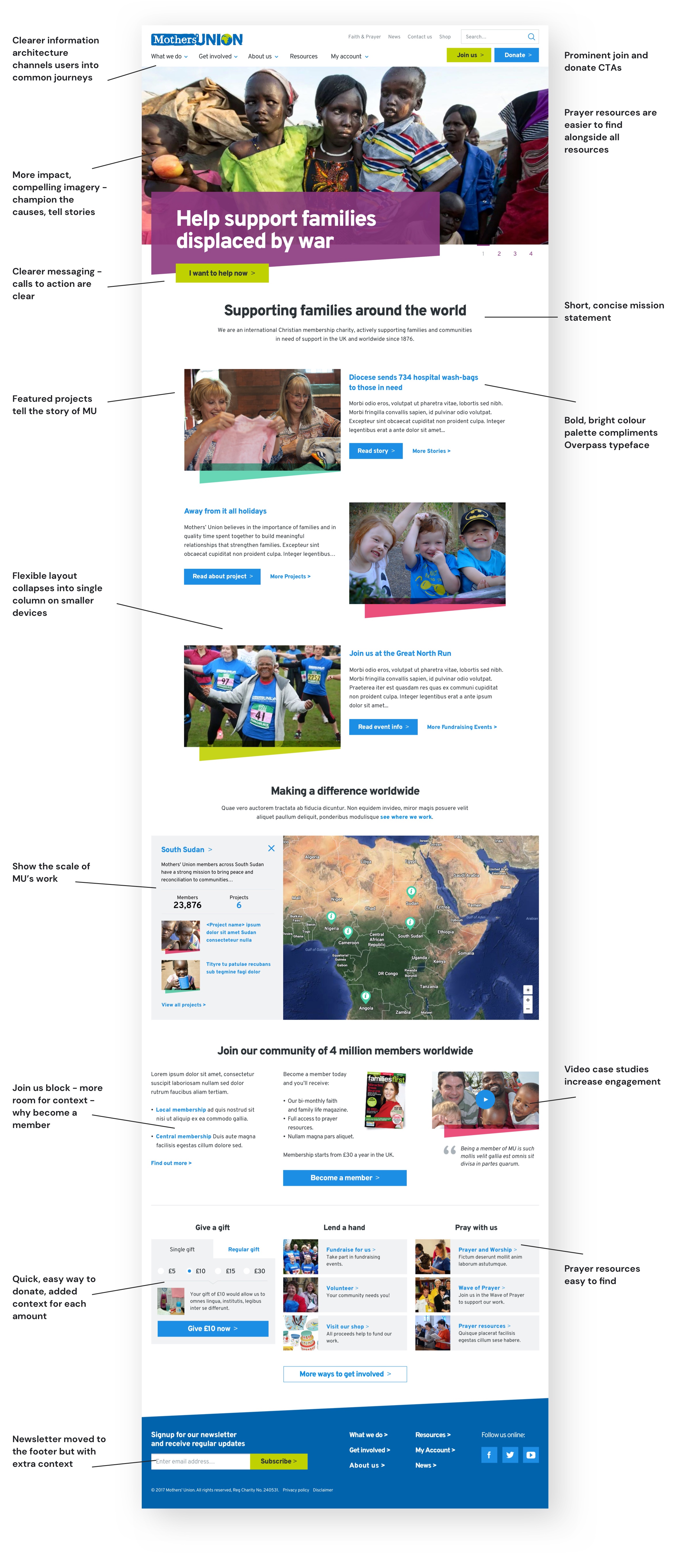
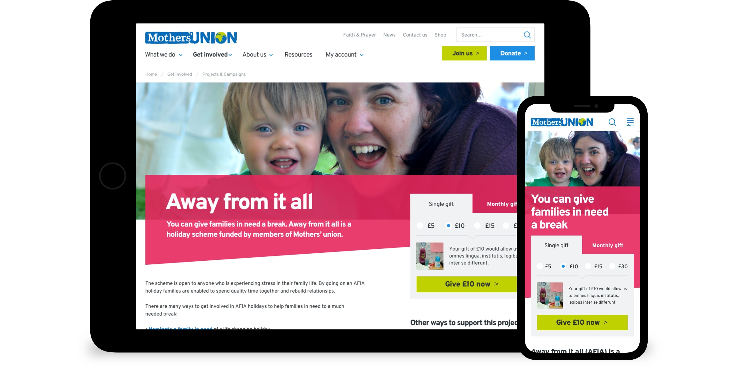
The flexible design easily adapts to all device sizes
An early design system
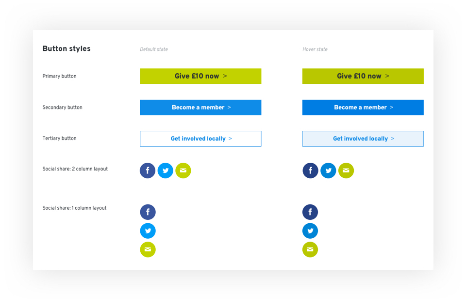
To ensure a consistent experience across the site, aid the development team, and help the organisation plan new functionality efficiently in the future, I created a simple design system to specify each component of the website, it's attributes and use.
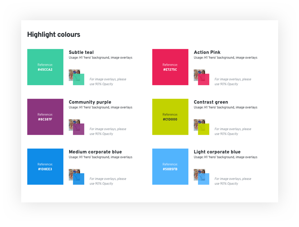
I devised a new colour palette that complimented the existing blue and green with a collection of intense highlights. The colours could be applied sympathetically to each page's content. For example, a project page with a donate CTA could utilise "Action Pink" to grab attention whereas a more community focussed page could use the softer "Community Purple".
Design system - colour specification
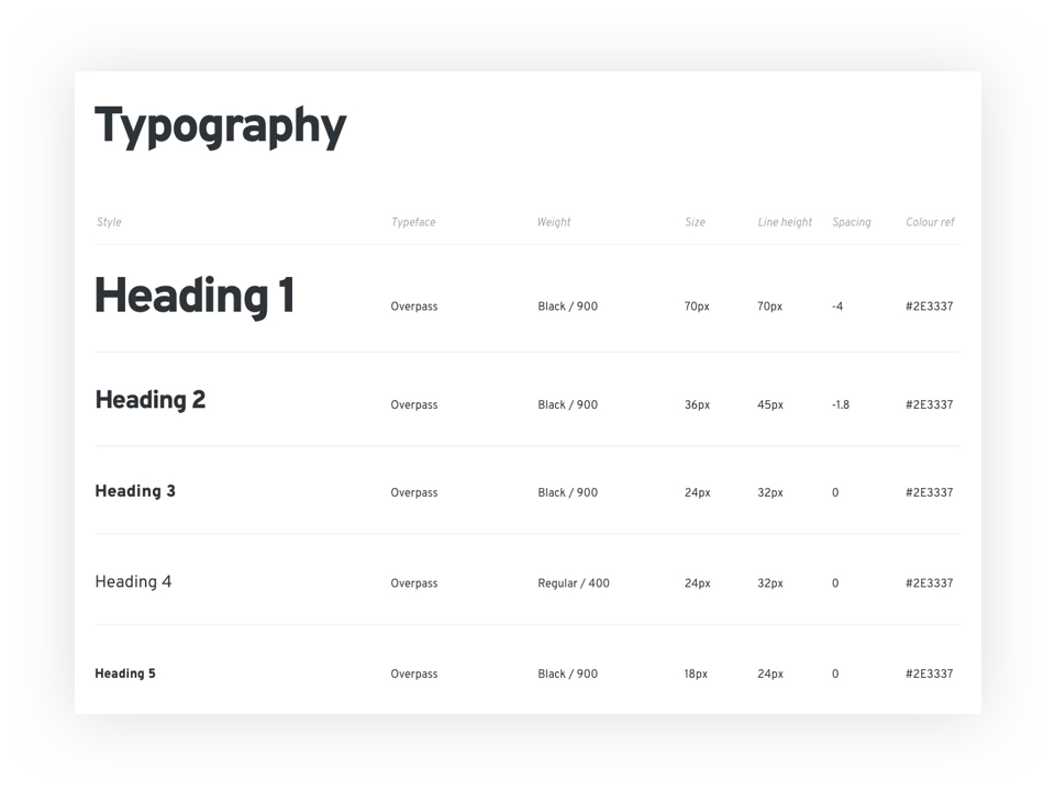
I chose Delve Withrington's Highway Gothic inspired Overpass typeface. It looks great on screens large and small, and conveys just the right level of character when headings are set in "Black" font weights that it compliments the bold design style.
Design system - typographical styles
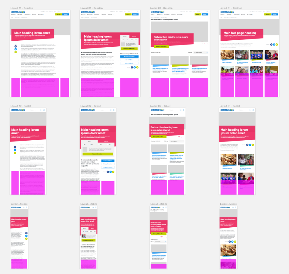
Ensuring a great experience across devices
To counter many of the structuring and hierarchy issues identified in an earlier user workshop, I set out a series of 4 template layouts that would ensure a consistent, responsive experience throughout the site. I also specified breakpoints and the row/column layouts at different screen sizes to aid the development team.
Design system excerpt - displaying responsive templates
Design system excerpt - Button styles
Results
The website performance looks promising so far, in the first month after going live, the homepage bounce rate had dropped by 10% and the exit rate by 14% so we can assume users are more engaged.
The search function appeared to be less relied upon with 10,000 less page views and a broader spread of views across the rest of the site. This may indicate our new structure and navigation is working better.
Prayer resources were the 4th most visited section of the old website and frequently came up in user interviews and workshops as a heavily used area of the site to improve upon. It is now the second most visited section (after the homepage) and appears much easier to find and use with page views increased by 694%.
And finally the get involved section (incorporating the new hub page template and clearer labelling of the ways users can support the organisation) has a reduction in bounce rate of 31%. Given the importance of this section in fostering future income from donations, membership and fundraising events, this is very welcome news.