I was approached to re-design the Latin American Travel Association website. As a major player in the international tourism industry, the website had to express the organisation's professionalism, trustworthiness and authority, whilst also conveying the vibrant diversity of Latin America.
The website caters for two main audiences - the first, members of the public who are looking for information about a destination and travel companies in Latin America, the second, travel companies who host information on the site. The homepage separates these two journeys clearly, allowing for quick access to the key areas of the site.
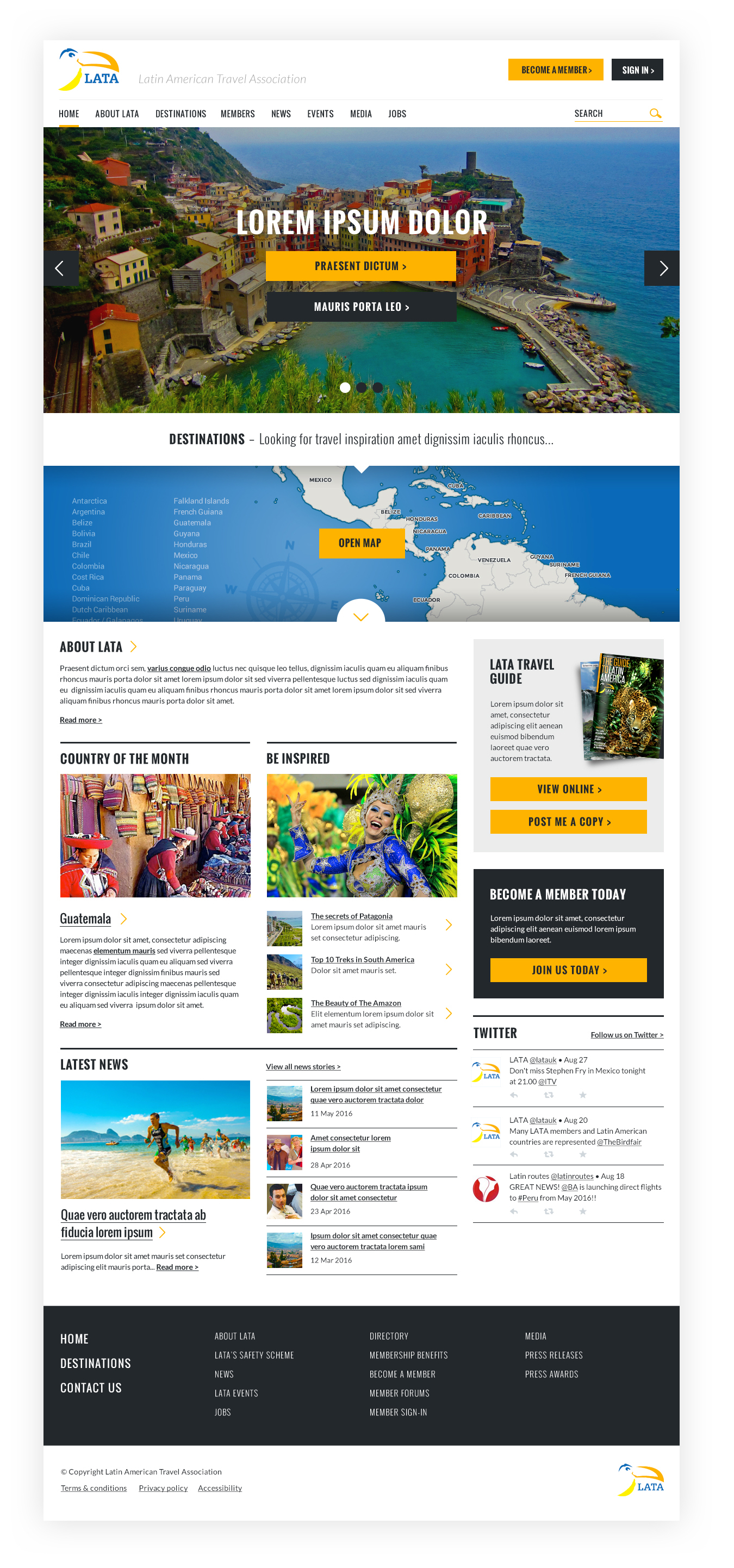
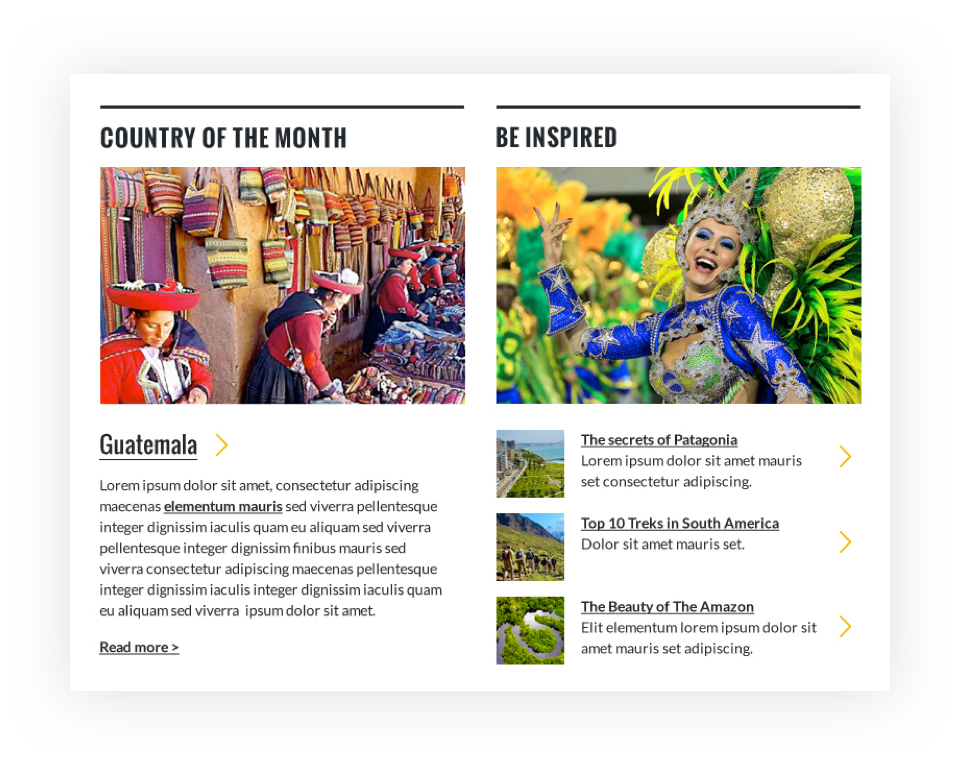
I opted for a simplistic interface design, allowing the photography to radiate the character and 'feeling' of the region. Making use of the bold, condensed typeface "Oswald" for headings paired with the clarity and readability of "Open Sans" for body copy, I was able to create a refined, modern typographical aesthetic.
Bold, clean typography
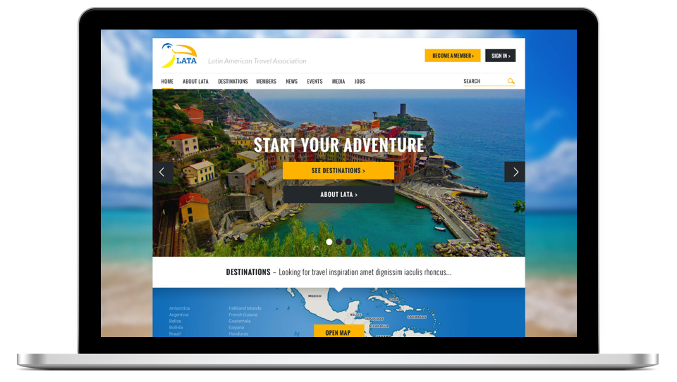
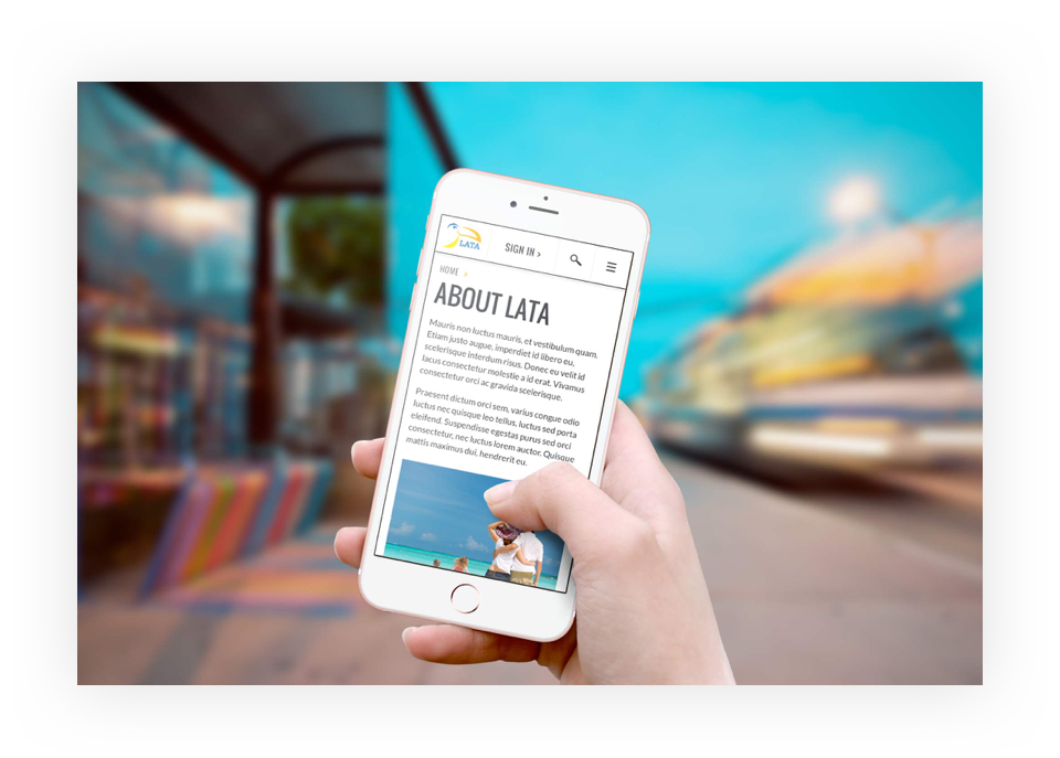
The finished site is mobile responsive so now LATA's users can access the website wherever they are.
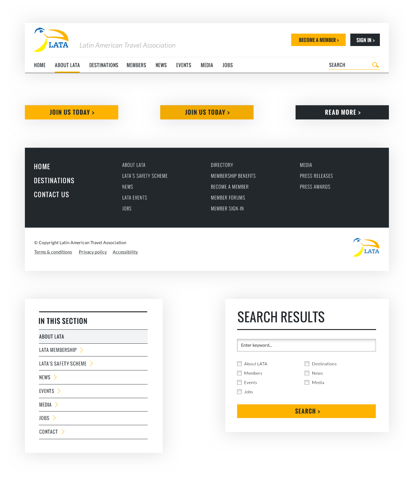
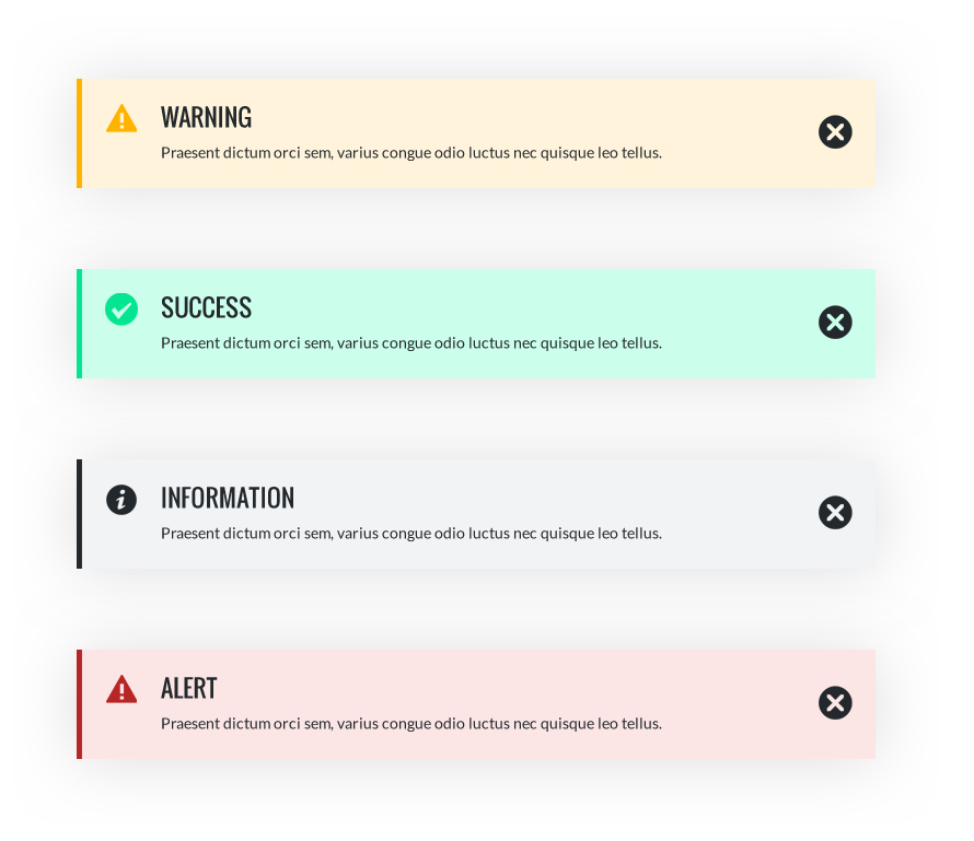
Design system
To ensure development was as quick and efficient as possible, I created a simple design system utilising consistent styling patterns throughout the interface that could be re-used as components and exported to Zeplin for effective developer hand off.
Notification states
User interface design of the components