During my time at Bluefrog I was responsible for leading the design and optimisation of the micro-finance website Lend with Care.
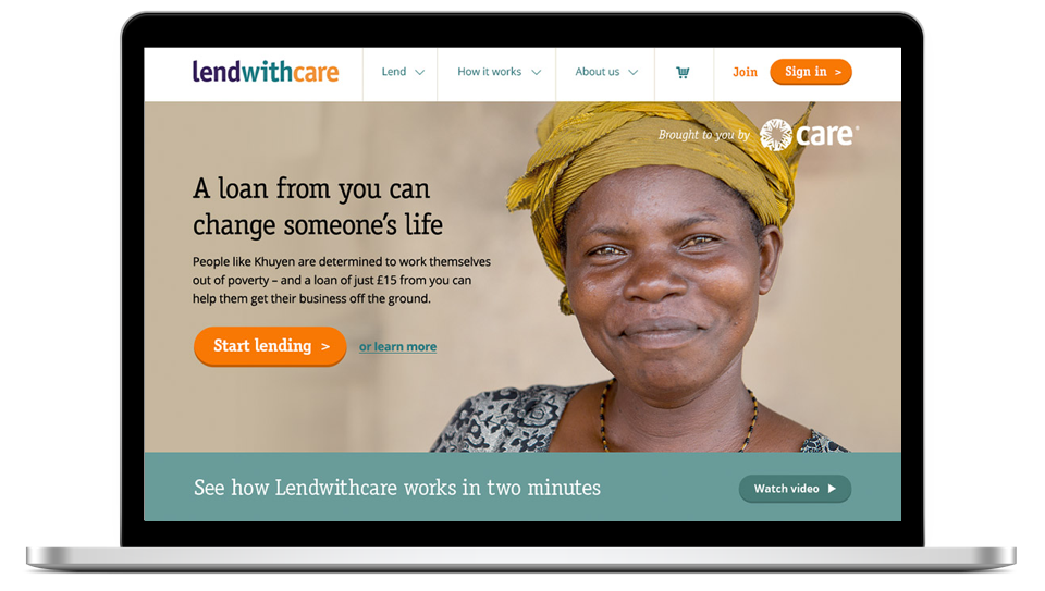
Using a combination of usability testing, analytics data and focus group findings I led the redesign and ongoing optimisation of the product to improve the site's user experience.
Focus group findings
Myself and the digital project manager co-hosted a focus group with 10 site users. We discussed what they liked about the site, any frustrations they had and any ideas for how we could improve the lending experience.
Initial learnings:
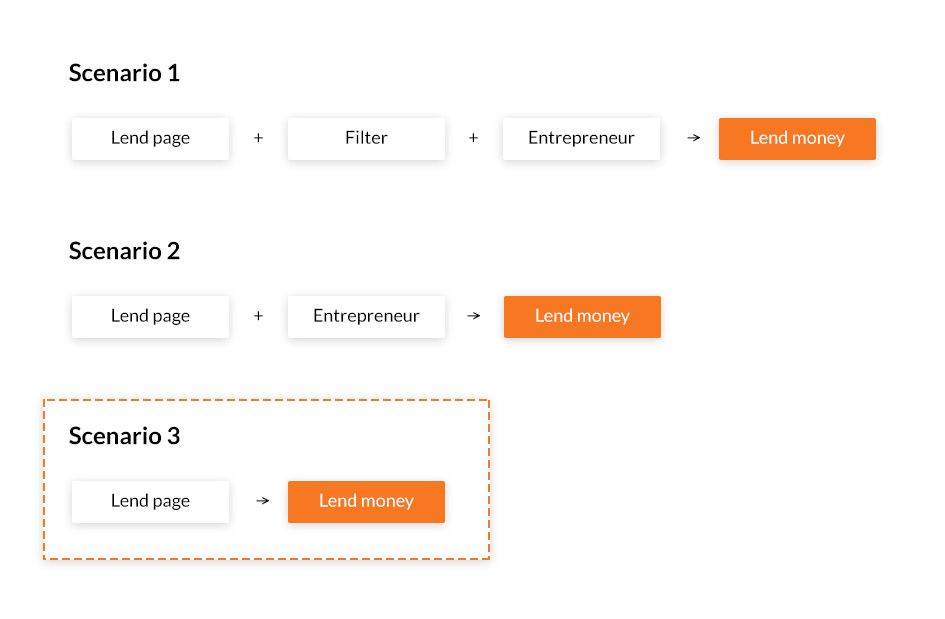
- Power lenders were not so interested in detail, could they lend more quickly?
- Users required easier access to personal information such as remaining credit
I mocked up a user flow to illustrate opportunities for faster lending
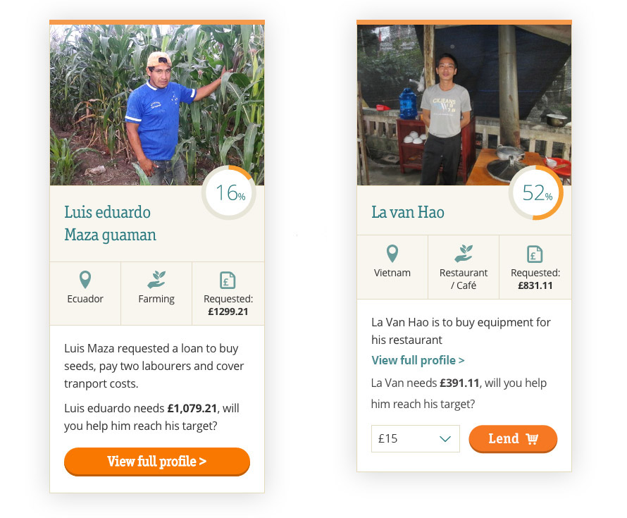
Re-designing card components for a faster UI: Old vs New with quicker lending
I remote tested a prototype using the new card designs with the same group of users, feedback was very positive, particularly the "power lenders" who were looking to quickly re-invest their credit.
Ideate. Test. Repeat...
I also experimented with a re-designed homepage "hero" banner that would allow quicker access to featured entrepreneurs. Whilst this seemed like a good idea at the time, when we ran a series of remote usability tests on an InVision prototype, we found users disliked the feature.
Learning from our mistakes - a banner approach that didn't work
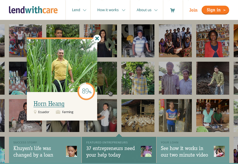
Learnings:
- The UI was too complicated
- It gave a poorer experience than filtering for entrepreneurs
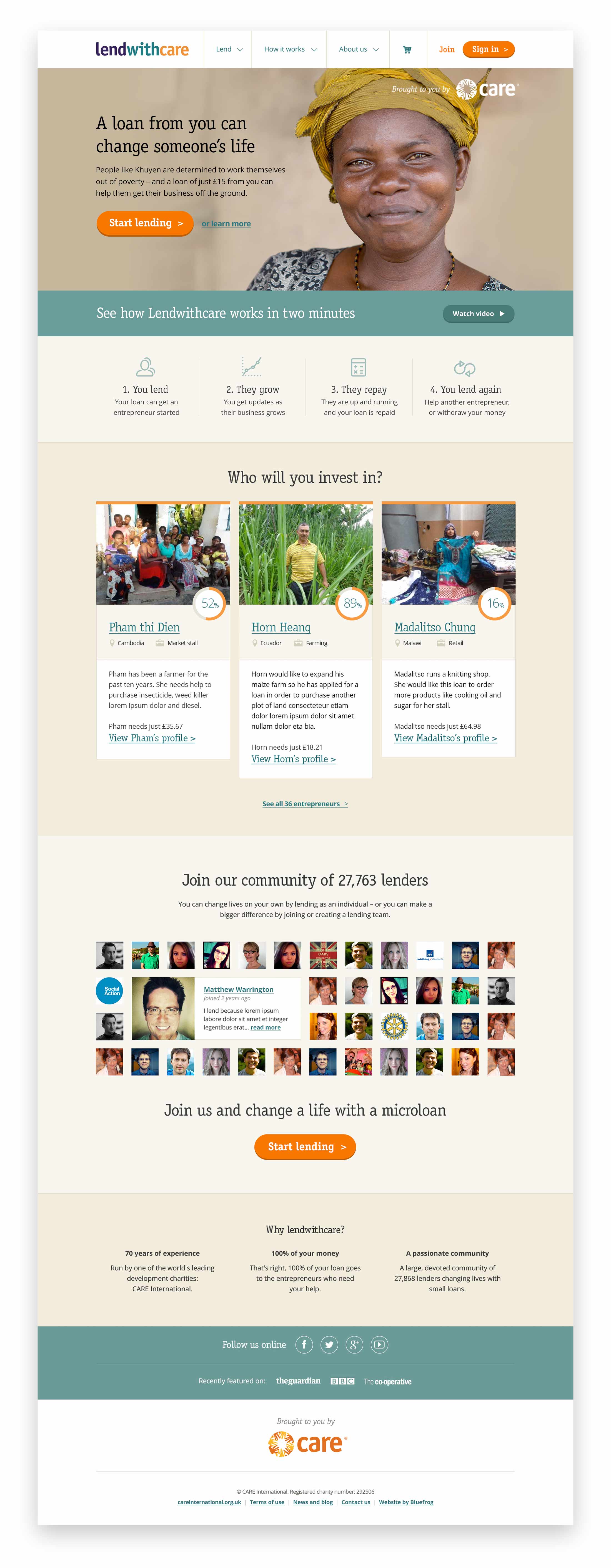
With that in mind I redesigned the banner to be a single promotional space, giving context to new users and a prominent call to action leading users to the entrepreneurs.
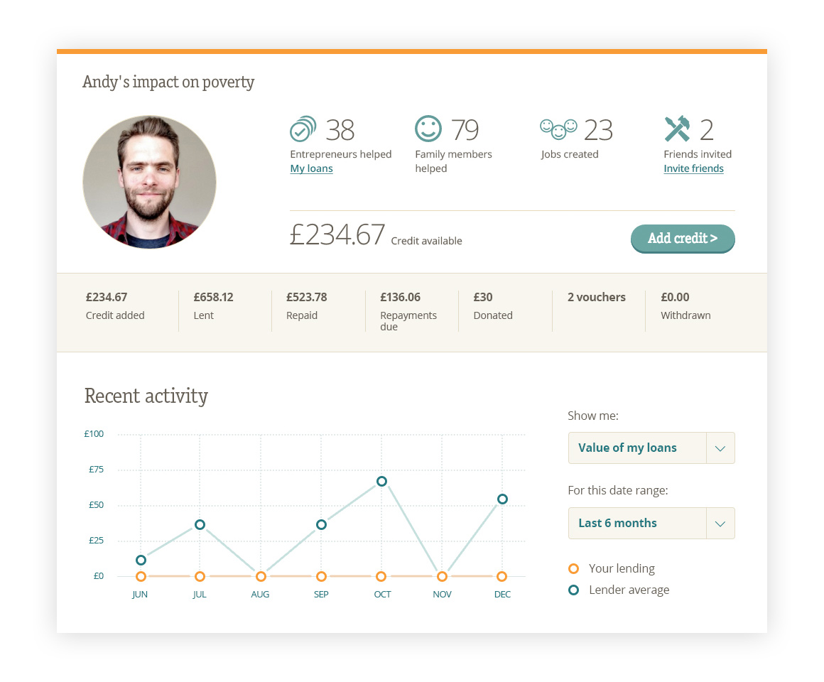
Dashboard
During our earlier focus group users had expressed the need for easier access to personal information such as the amount of credit in their account and the status of their existing loans. To improve this I designed a new homepage dashboard for signed in users. This featured all the statistics regarding their account and quick links to access more detailed content about their loans.
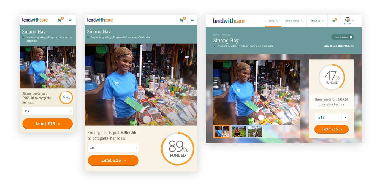
Responsive web design
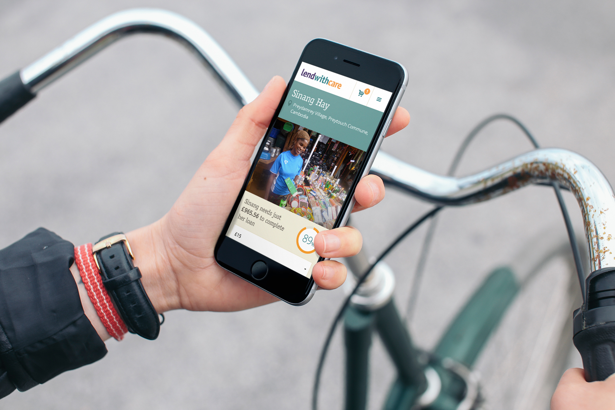
Back in 2014, I conducted a Google Analytics review and discovered that nearly 30% of users were being underserved by a lack of responsive design. That amounted to around 2,500 frustrated users every month.
I redesigned the UI to incorporate a flexible layout pattern that would provide a clear visual hierarchy, meet the AA level of Web Content Accessibility Guidelines and work seamlessly across all device sizes.
Upon re-designing the website frontend, paying particular attention to the mobile use context, I noticed a significant rise in mobile session duration, a big drop in mobile bounce rate and an 85% increase in new mobile users.
Responsive layouts
Structured design
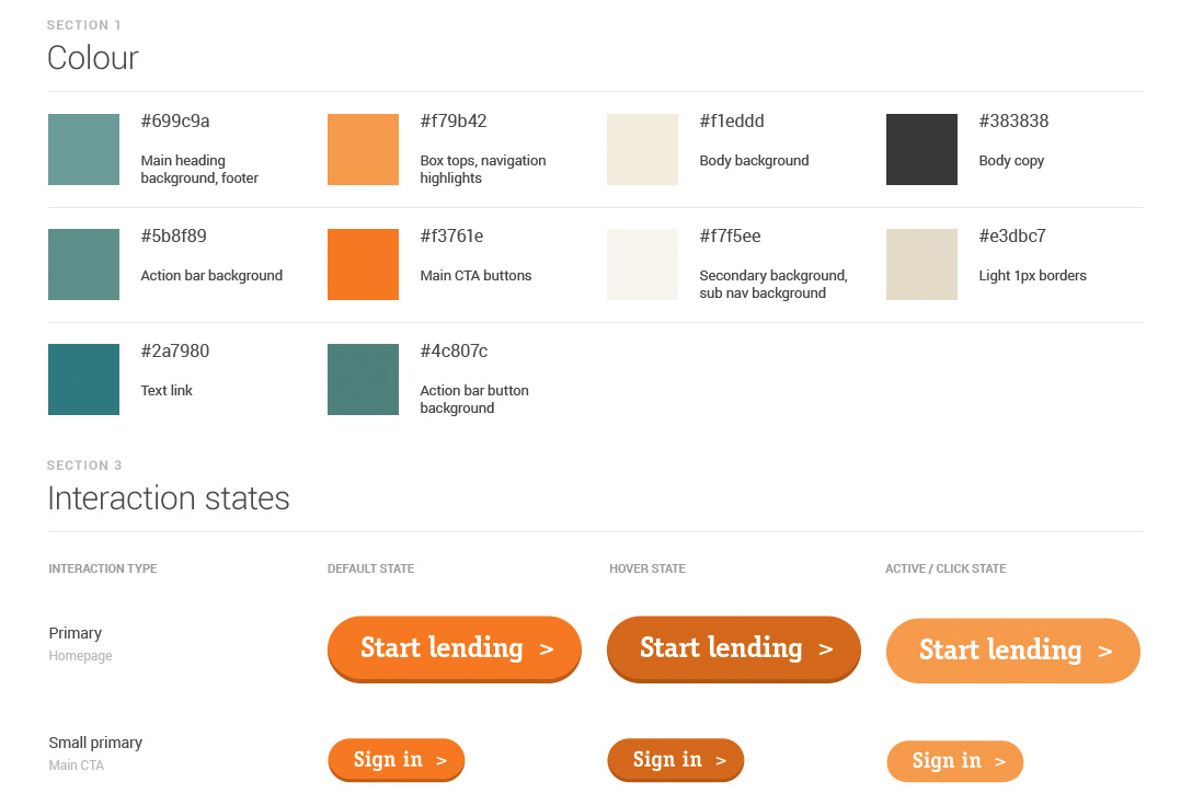
The website required a structured design system to allow us to ensure visual consistency across all elements of the site and minimise engineering time.
I created a style guide and HTML / CSS reference file to act as a repository for all aspects of the site. This helped speed up future developments and also helped in decision making when new functionality was being discussed.
Ongoing success
The lendwithcare website has become a phenomenal success, £20 million has been lent through the website so far and it attracts on average 30,000 visitors every month.
I really enjoyed being part of this project and having the direct opportunity for my skillset to improve people's lives. More and more people are lending as the product gains popularity, that means more help for those in the developing world.
Visit Lendwithcare.org today >